McCaffrey’s Catering
The McCaffrey’s Catering Catalog had drifted away from the people it was meant to serve.The previous book leaned heavily into an elevated, wedding-forward aesthetic that positioned catering as aspirational and formal. In practice, this created friction. McCaffrey’s is a grocery store first, not an event planning company, and most customers were not hosting black-tie events. They were celebrating milestone birthdays, retirements, showers, and everyday gatherings where convenience mattered more than perfection.
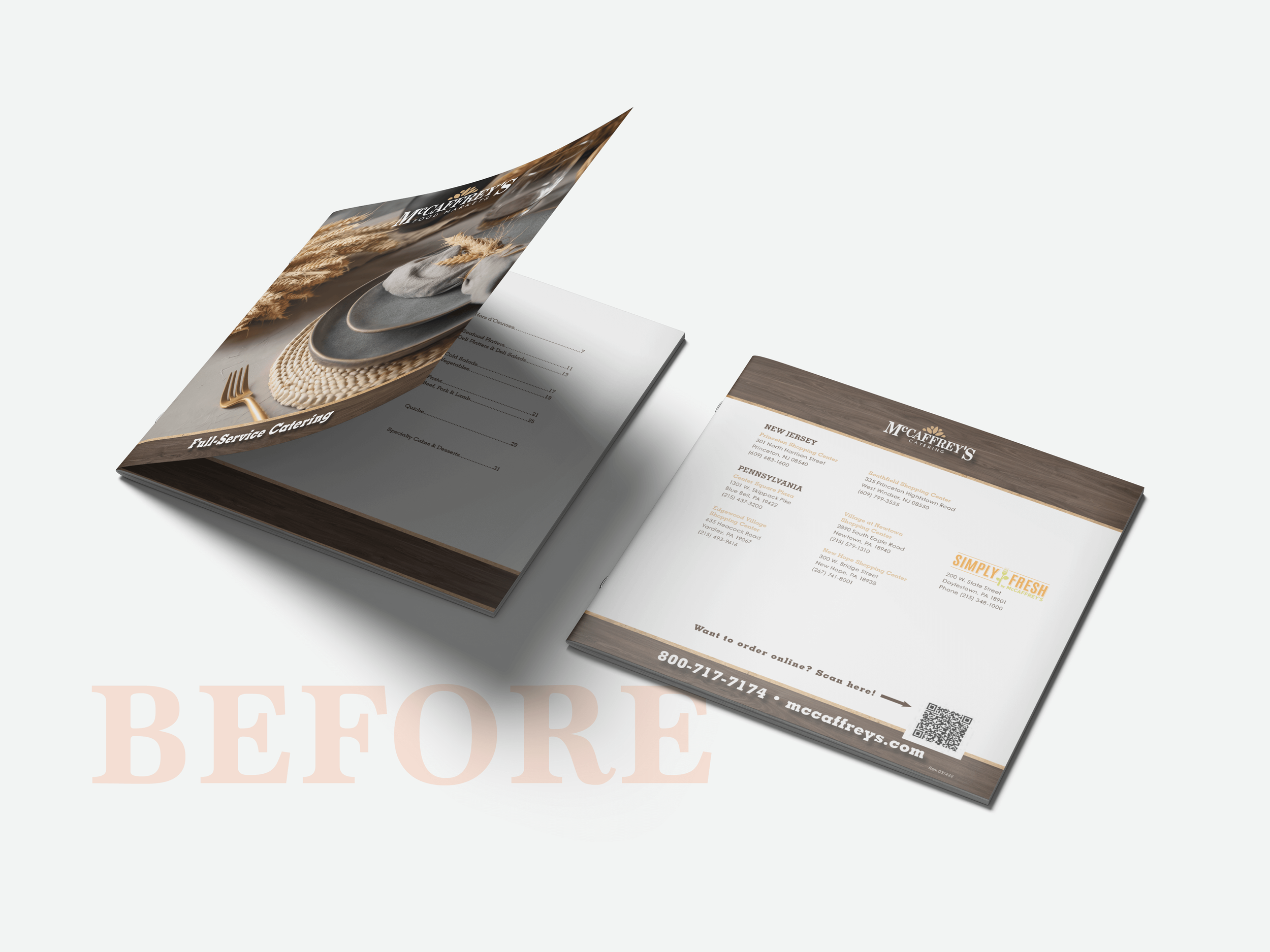
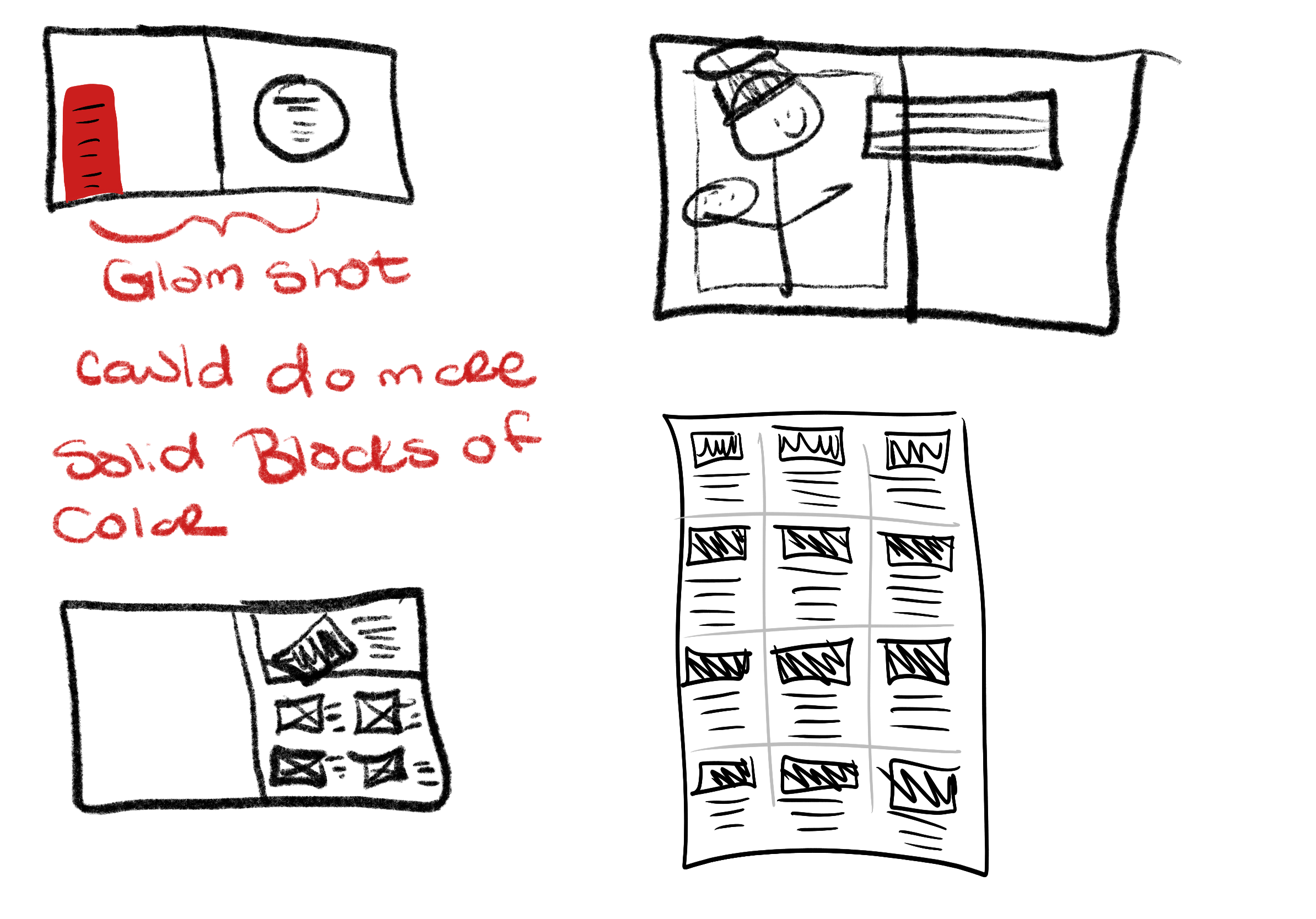
The catalog also struggled functionally. Its small 8×8 format was difficult to merchandise, easy to overlook, and lacked the descriptive clarity customers needed to feel confident ordering. Some offerings skewed more elevated than what customers typically chose, reinforcing the idea that catering was out of reach. The challenge was to reposition catering as accessible, supportive, and designed to make hosting easier, not more intimidating.
Role:
Creative Direction
Brand Strategy
Project Management
Continuity Management
Data Management
Photography Assistant
Catalog Design
Launch Campaign
Prepress
Year:
2024 - 2025
Photography By : A. Wilkinson

Catering should support real life, not compete with it.

Designing for How People Actually Gather
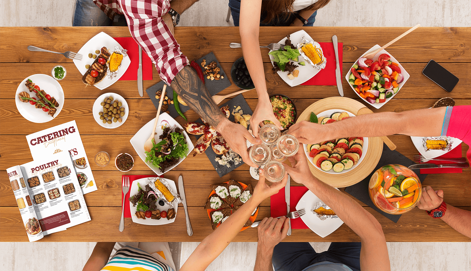
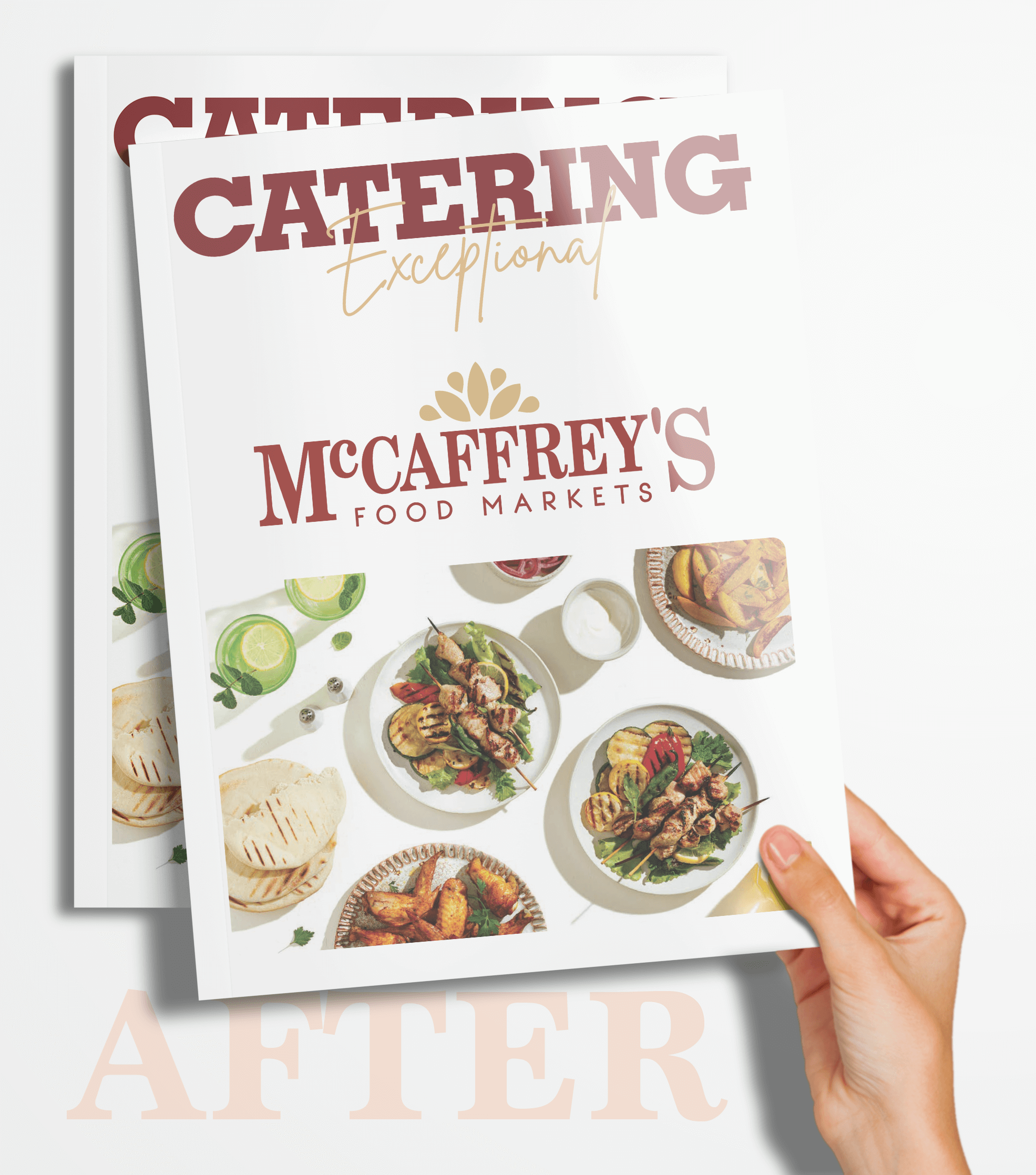
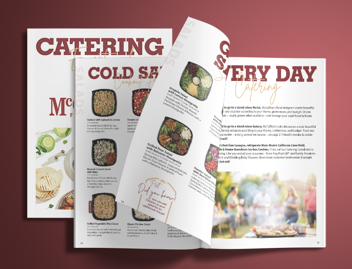
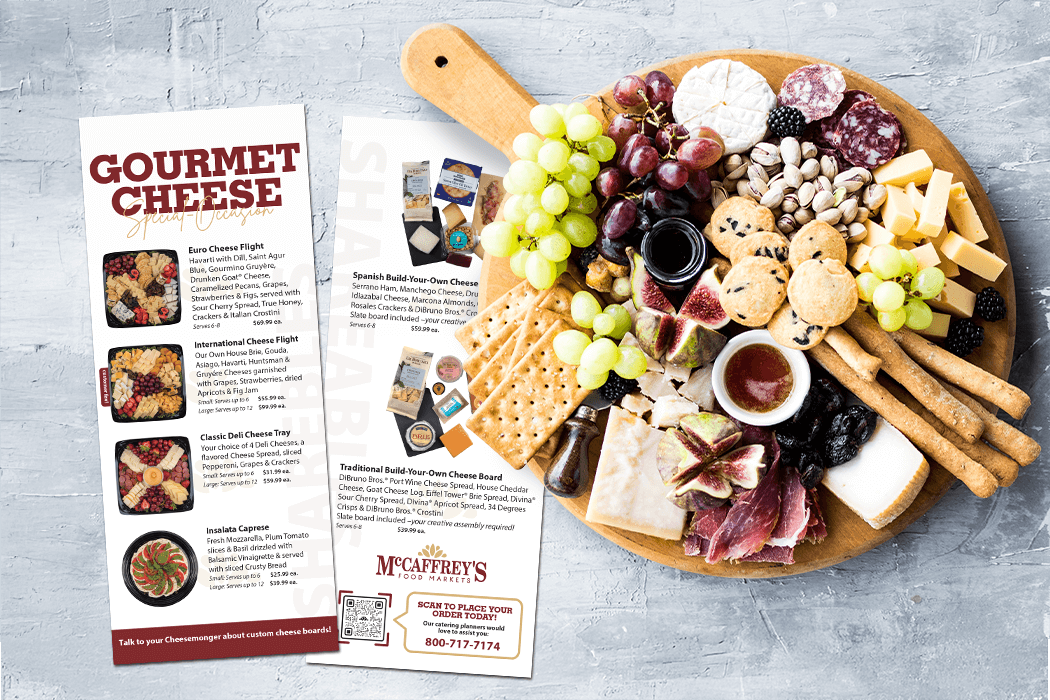
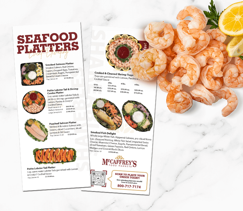
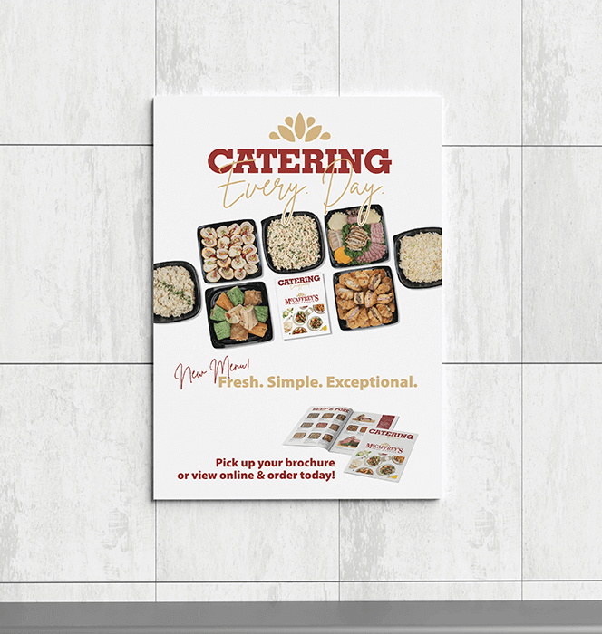
Catering lives in real homes, not staged venues. The new catalog needed to reflect how customers plan events in practice. It led with everyday offerings, clear descriptions, professional food photography of actual dishes and supportive tools like planning checklists and family favorite dish suggestions. The message was simple and intentional. You already know how to cook. We are here to make it easier.
Strong systems create
freedom, not limitation.
Systems Over One-off’s
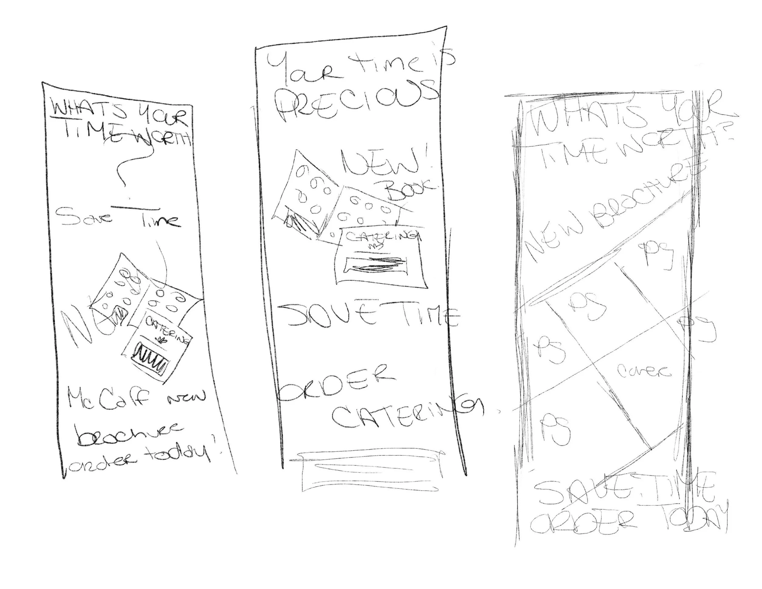
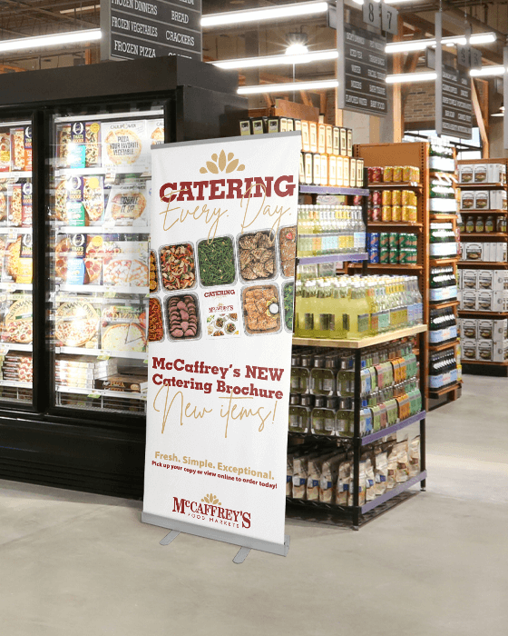
This project was never meant to be a single deliverable. The catalog became the foundation for a broader visual system that could scale across marketing materials, digital assets, and future updates. Moving to a standard 8.5×11 format created more real estate, improved shelf presence, and offered
long-term flexibility without increasing print costs.
Good leadership is knowing where to spend effort, and where not to.
Letting Function Run the Design
Budget constraints required thoughtful decision-making. Taking on additional responsibilities such as functioning as a photography assistant, allowed resources to stay focused where they mattered most. Once timelines were set, every phase of the project was documented and structured to keep collaborators aligned and accountable.
Design decisions are strongest when they are backed by reality.
Challenging the Aesthetic Assumption
One of the biggest shifts required internal buy-in. While some stakeholders still believed an elevated black-tie aesthetic was the right direction, sales data and customer feedback told a different story. The final design intentionally moved away from formality and toward clarity, warmth, humor and approachability, reinforcing that catering is for everyone.
Performance Indicator
While detailed sales reporting was not available, the new catalog established a clearer and more practical framework for presenting catering offerings. The redesign improved readability, expanded menu descriptions, and introduced planning guidance that better supports how customers actually organize events.
Internally, the catalog now functions as more than a marketing piece. It serves as a reference tool for staff and customers alike, helping streamline conversations around catering options and event planning. By shifting the tone from aspirational wedding aesthetics to approachable, everyday gatherings, the catalog better reflects the brand’s role as a neighborhood grocer supporting real-life celebrations.
The project also created a visual foundation that continues to support related marketing materials and digital assets, reinforcing consistency across the catering program.
If you’re looking for a designer who thinks strategically, works collaboratively, and sees projects through, I’d love to connect.