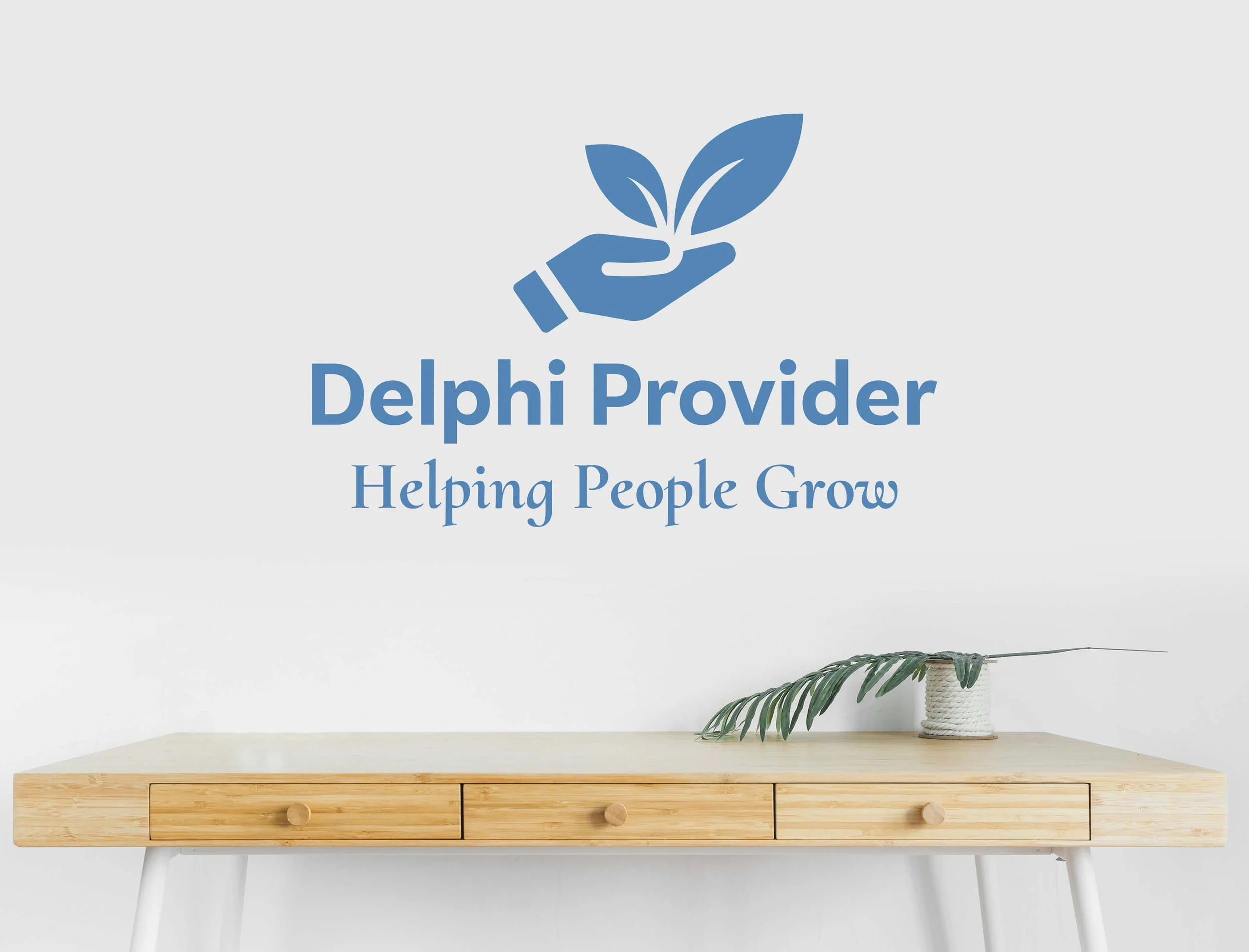
Delphi Provider
Delphi Provider came to me with a visibility problem rooted in trust and access.
At the time, Facebook was their only web presence. While it allowed for basic communication, it lacked the depth, clarity, and security families needed when seeking support services for children with intellectual and developmental disabilities (IDD). There was no centralized place to explain services in detail, no secure way to initiate sensitive conversations, and no consistent brand presence to reinforce legitimacy.
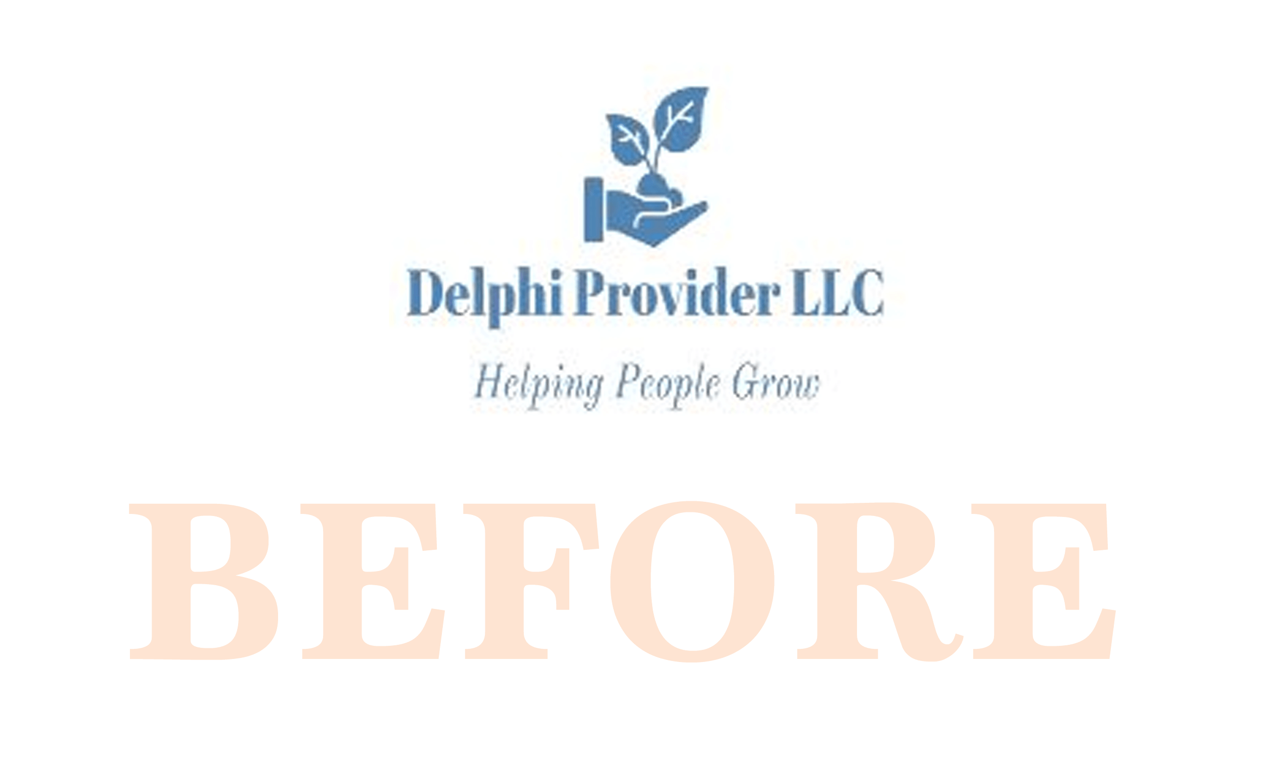
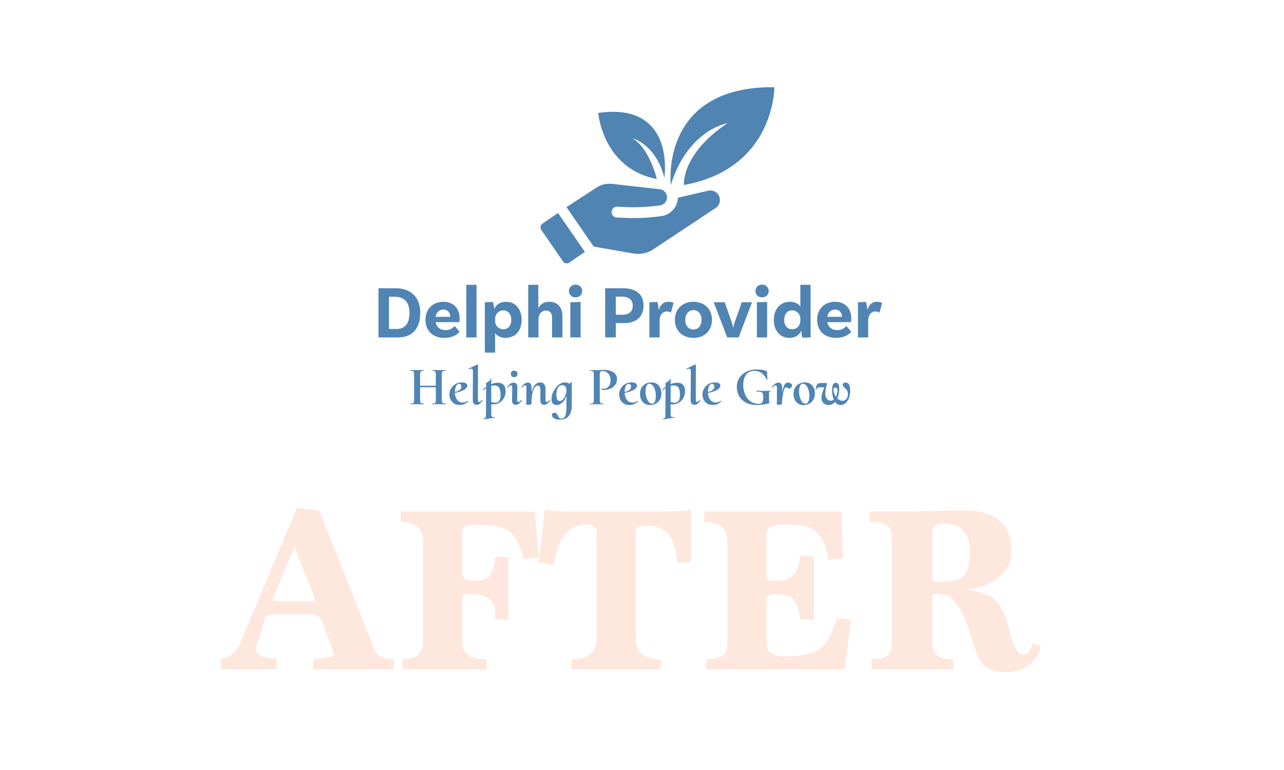
Delphi also did not yet have a formal brand. Their existing logo was a
low-resolution mark created through a Cricut machine, and visual consistency across touchpoints was nonexistent. To support families navigating an already overwhelming process, Delphi needed a clear, accessible foundation that communicated care, credibility, and intention from the first interaction.
Role:
Creative Direction
Brand Strategy
Project Management
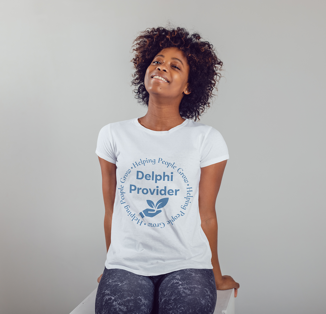
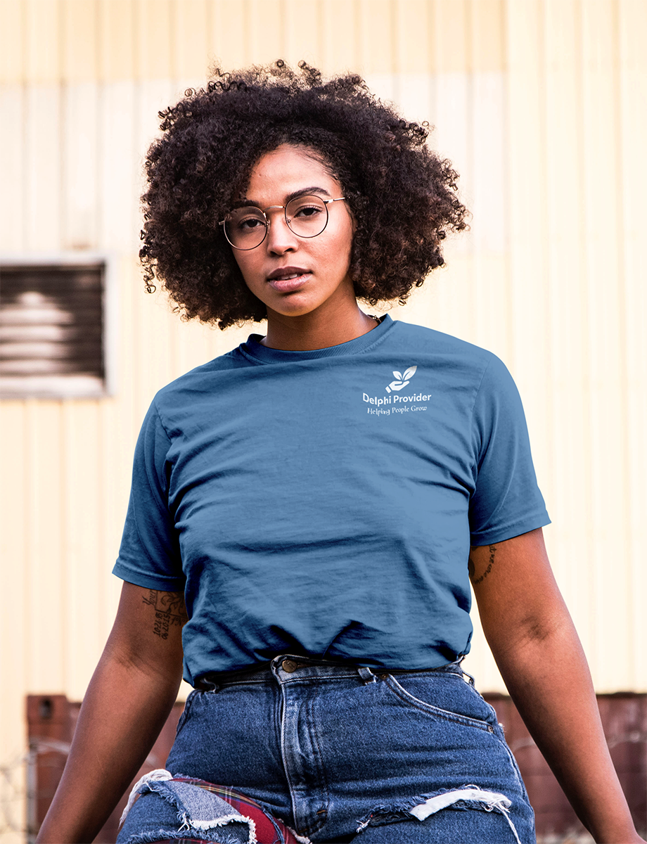
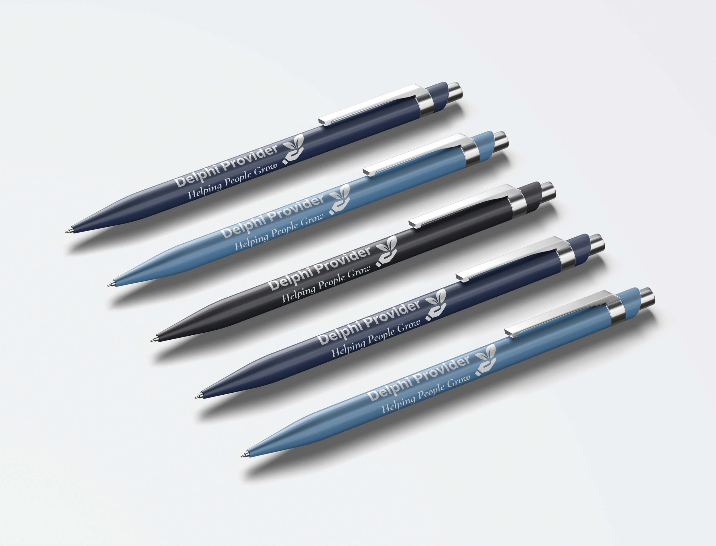
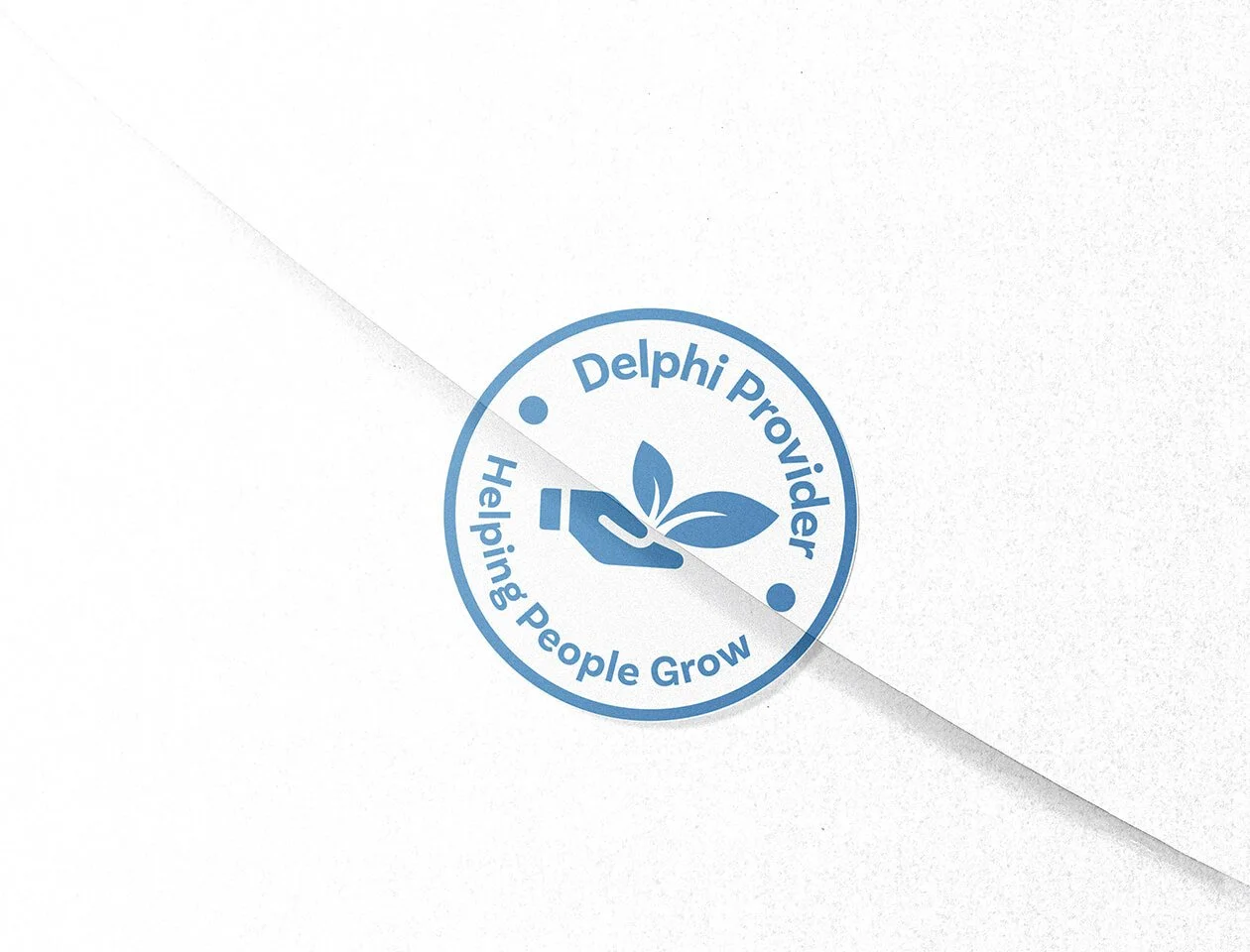
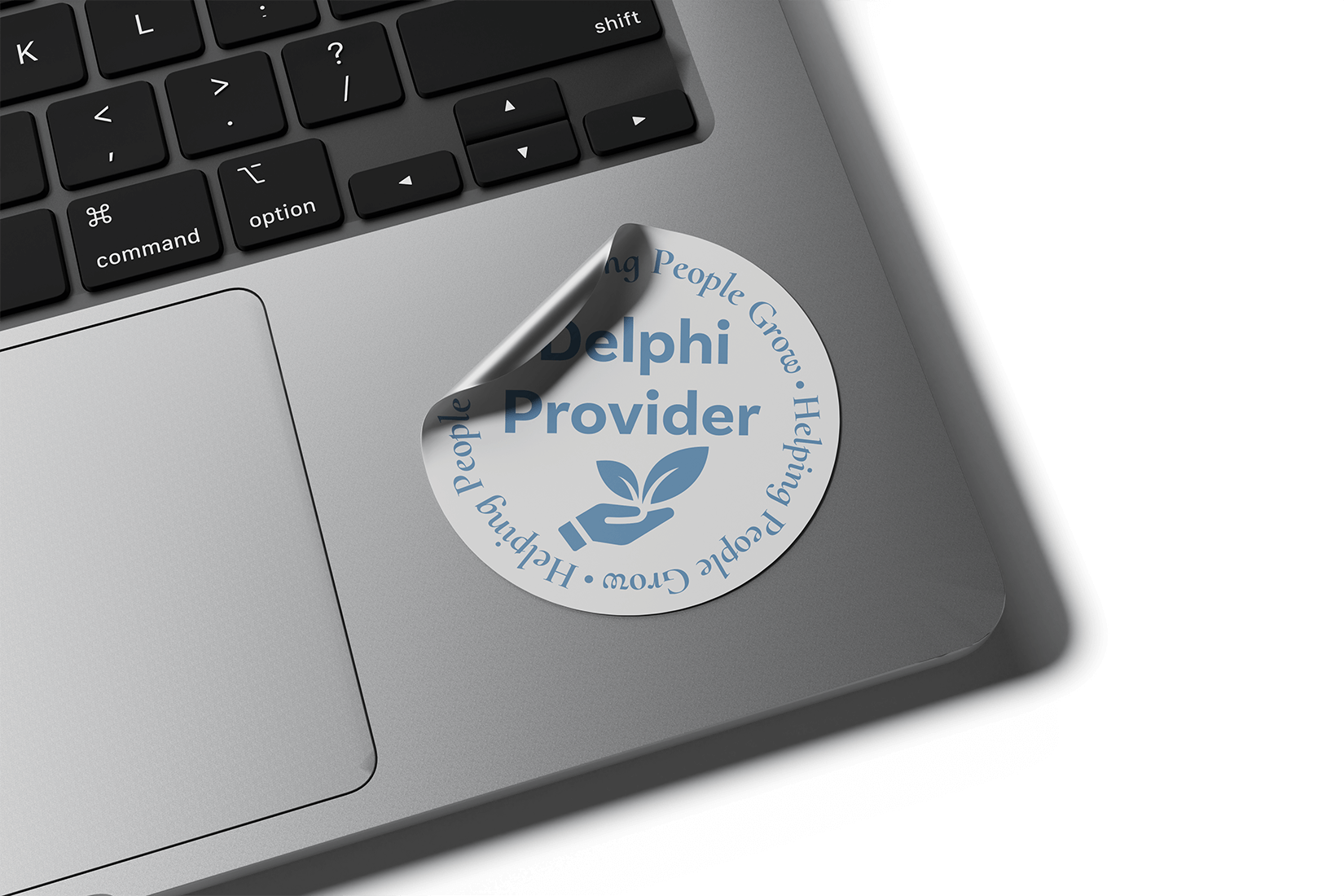
Brand Identity Design
Website Design
Content Management
Year:
2024

Trust is built through clarity,
not decoration.

Designing for Trust First
When working in spaces that support vulnerable communities, design must remove friction rather than introduce personality. The primary audience for Delphi is families of children with special needs, many of whom are already navigating emotional, logistical, and informational overload. The brand and website needed to feel calm, supportive, and dependable above all else.
Good design makes people
feel supported before they
feel impressed.
Accessibility is NOT Optional
Accessibility considerations informed every decision, from typography and color contrast to layout and content hierarchy. White space was used intentionally to reduce cognitive load and allow information to be absorbed at a comfortable pace. Imagery was carefully selected, with parental approval, to ensure dignity, consent, and respect.
The best systems leave room
to grow.
Building a Foundation, Not a Finish Line
The scope included a mini brand system and a two-page website designed to grow alongside the organization. The branding established consistent visual rules across all touchpoints, while the website provided a secure, professional entry point for families to learn about services and make contact. The structure was intentionally simple, allowing for future expansion without needing to rebuild from scratch.

Project Outcome
Delphi Provider launched a live website with a clear service overview, secure contact pathway, and a cohesive mini brand system that supports credibility and recognition across all touchpoints.
Community Impact
The organization is actively servicing families within the community, using the site as a foundation for growth, outreach, and future expansion.
If you’re looking for a designer who thinks strategically, works collaboratively, and sees projects through, I’d love to connect.