Clarity Point
Energy Partners
Clarity Point Energy Partners was entering a highly competitive and tightly controlled market as a new venture, where credibility is often assumed only after years of visibility.
The founder was ready to branch off on his own, but in order to compete with established players, the brand needed to communicate trust, expertise, and longevity from day one. In an industry where a small number of firms dominate and decision-making carries real financial risk, appearing inexperienced or unclear was not an option.
The challenge was to build Clarity Point from the ground up with a brand and website that felt established, credible, and easy to understand. The work needed to resonate with busy executives who were short on time and looking for clarity, not complexity. From the first interaction, potential clients needed to feel secure, informed, and confident enough to inquire.
Creative Direction
Brand Strategy
Project Management
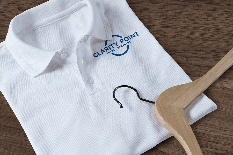
Brand Identity Design
Business Consulting
Website Design
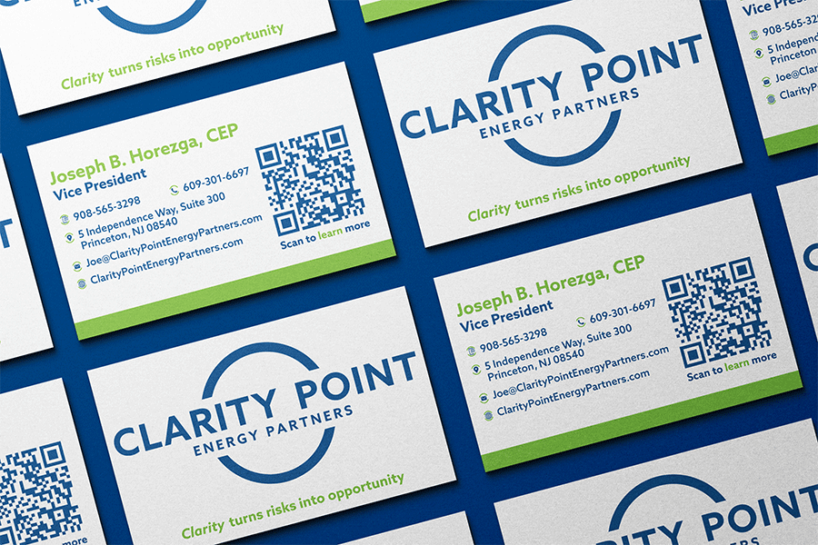
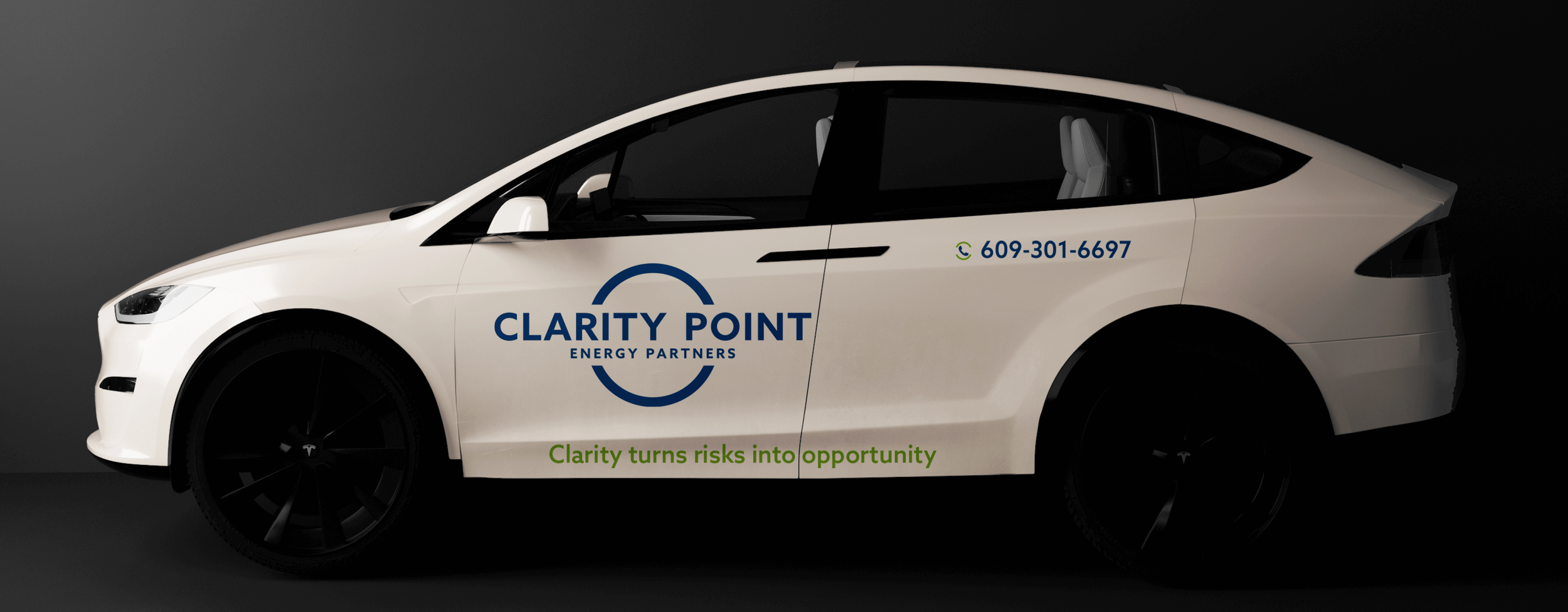
Collateral Design
Prepress
Role:
Year:
2023

Longevity is designed,
not claimed.

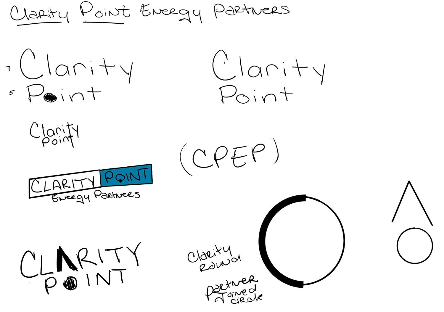
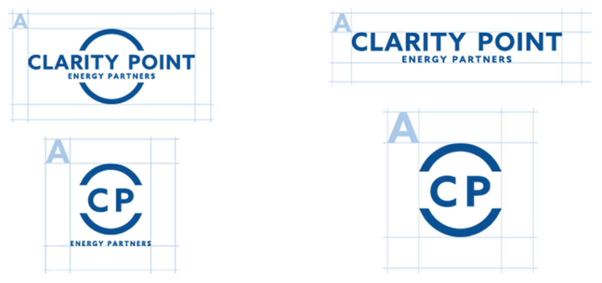
Establishing Logevity Without Looking Dated
Although Clarity Point was a startup, the brand needed to signal permanence. The identity was designed to feel modern and clean without chasing trends that would quickly age. Typography, spacing, and structure were chosen to communicate stability and clarity rather than novelty.
Good branding communicates before it explains.
Using Color as Subliminal Communication
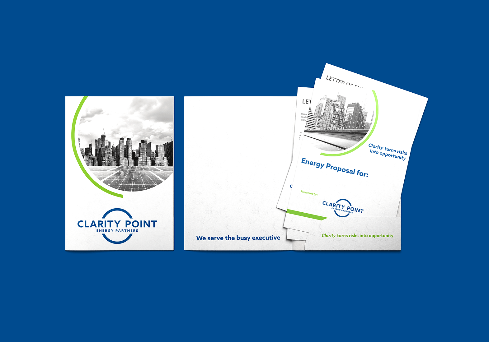
Color choices were made intentionally to support trust and credibility in a crowded energy market. Rather than relying solely on green, a color often overused in energy branding, the palette was designed to subtly convey authority and reliability without leaning on expected visual shortcuts.

Clarity is a competitive advantage.
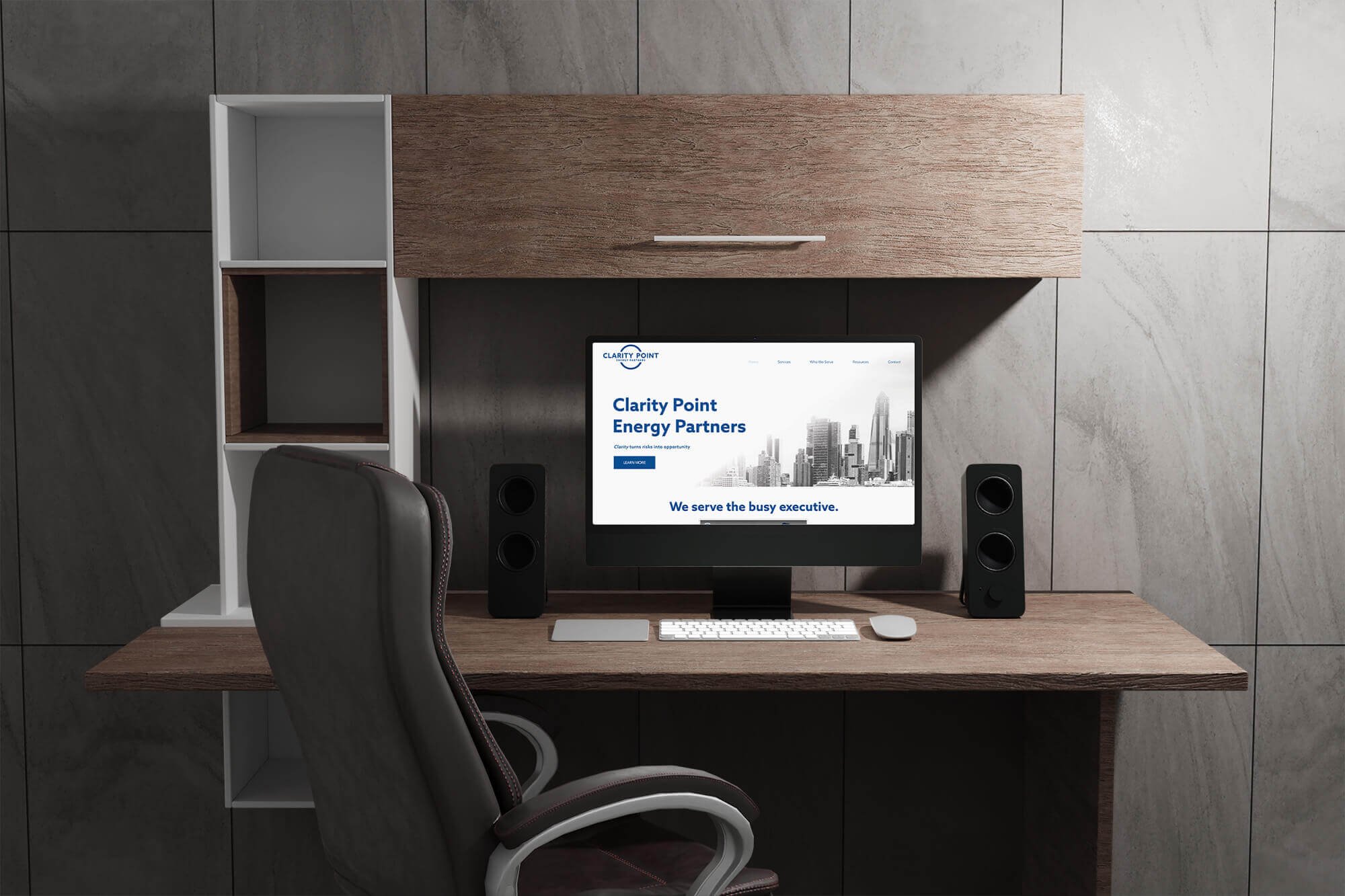
Designing for Busy Decision-Makers
The primary audience was the executive who needs information quickly and clearly. The website prioritizes readability, logical flow, and visual hierarchy so visitors can understand services, value, and next steps without friction. Language was written to be approachable and direct, avoiding the dense and overly technical tone common among competitors.
Confidence comes from understanding, not volume.
Balancing Education and Authority
Clarity Point needed to educate clients without overwhelming them. The site uses positive white space to create breathing room and allow information to be processed comfortably. Visual tools such as icons and graphs support understanding and also serve as internal reference points for the Clarity Point team during sales conversations.
“Felicia provided us with a tailored branding package that we would not have been able to complete on our own. She listened to our wishes and helped us present ourselves as an established advisory firm with a clear, crisp message and look.”
Project Outcome
Clarity Point Energy Partners launched with a complete brand identity and a clean, informative website designed to support credibility, education, and lead generation from day one.
Business Impact
The website is actively used in sales conversations and serves as a foundation for positioning Clarity Point as a trusted advisory partner. The client reports increased confidence in presenting their business and engaging prospective clients.
If you’re looking for a designer who thinks strategically, works collaboratively, and sees projects through, I’d love to connect.